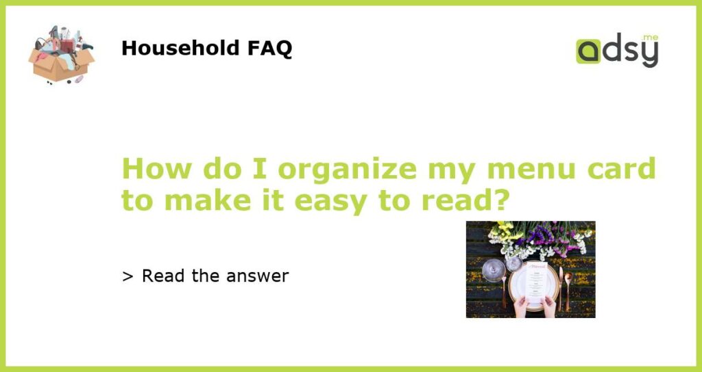
6 Tips for Organizing Your Menu Card for Easy Reading
Your menu card is the first interaction your customers have with your restaurant’s offerings. It is crucial to ensure that it is well organized and easy to read. An organized menu card can help your customers make informed decisions, increase order frequency and boost customer satisfaction. Here are six tips for organizing your menu card for easy reading:
Use Descriptive Headings and Subheadings
Headings and subheadings are effective at breaking up large blocks of text and directing readers’ attention to specific items. Each section should have descriptive headings and subheadings to help customers find items quickly. For instance, you can use “Starters,” “Main Courses,” and “Desserts” as headings and “Vegetarian Starters” and “Beef Main Courses” as subheadings.
Categorize Your Items
Categorizing menu items is an effective way to make your menu card easy to navigate. By organizing your items in categories, you are grouping similar dishes together, making it easier for customers to hone in on their preferred item. You can organize your menu by food type (sandwiches, pasta, seafood, etc.) or by occasion (breakfast, lunch, dinner).
Keep Your Descriptions Short
Lengthy item descriptions can make your menu card look cluttered and confusing. Ensure that each item is described in 2-3 bullet points or sentences highlighting its main points such as what ingredients are included, how it is cooked or prepared, origin, and any allergens present. If possible, avoid using jargon and technical language that may be difficult for customers to understand.
Organize Items in Order of Popularity
Place your most popular and profitable items near the beginning (top) of each section. Not only will doing this increase the chance of these items being ordered more frequently, but it will also increase their visibility and make them easier to find. You can also use graphical elements, such as images or icons, to highlight your popular dishes.
Use White Space Effectively
White space, or negative space, refers to the empty space surrounding design elements. It is a powerful tool for improving readability by creating a more balanced layout. It also ensures that the menu card appears organized and not cluttered. When designing your menu, consider including space between menu items and sections. Increasing the font size of the headings or item names can also create the desired effect.
Organizing your menu card is a critical aspect of the customer experience you offer. By following the tips discussed here, you can create an organized, easy-to-read menu that makes a positive impression on your customers. Remember to keep your menu up-to-date with seasonal items, daily specials, and any changes made to your offerings.


